I can't link every editorial I posted directly to my ideas, but all these images inspired me and helped me learn more about editorials and the concept of the image and layout, colours, hair and make up etc. It also showed me how much editorial images are linked to the catwalk looks. I know that the clothes are the same but I never noticed how many links there were and that most use the same hair and make up.
This first editorial is by FENDI, featuring Cara Delevigne. What I liked about it was the movement of the hair in the first image, and the black frame that is around both images. The background (and clothing in the first image) is very light so the black worked very well and created more depth. The brand's logo is yellow, in the bottom right corner which goes well with the blue hues in first image and the fuchsia bag in the second image.
I also like how the cropped the hair in the top photo. In that image the hair is in the air as she is posing on top of a building whereas in the second photo she is on the ground, the fabric of the jacket is hanging down and so is her pony tail.


FENDI
A/W 2013
Model: Cara Delevingne
LOVE Magazine
No other information was in the magazine
The shadows are what made me stop and look at this editorial by DSQUARED2 twice. The background and model's skin is quite white and pale and the clothing is black, dark which is a contrast on its own, but the harsh lighing really added to the effect as storng shadows came up in the background. In contrast to the dark image with a lot of depth, the frame is white.
Every other model has nude / red lips and the hair is black and slicked.

DSQUARED2
A/ W 2013
No other information on the image
LOVE Magazine
There were quite a few editorials featuring flowers, even though the collections were for Autumn / Winter (2013). This first one is by Nina Ricci and I liked how they put the image in black and white as usually editorials with flowers are quite colourful.
This brings me to the next set of editorial images where flowers play a big part, and are in colour. The male models are placed in a quite feminine setting and poses are also quite feminine, expecially in the last image. This shows that not all men have to be manly and pose with tools, sweaty and shirtless. They put the model's names in big white capital letters in each image, my favourite image is the third one as the model is hiding behind a bunch of flowers, peaking through.

Nina Ricci
A/W 2013
Model: Giorgia
Love Magazine
No other information found

A/W 2013
Model: Boby
Photographer: Solve Sundsbo
Florist: Rambert Rigaud
MUA: Lisa Eldrige
Hairstylist: Syd Hayes
Love Magazine
No other information found
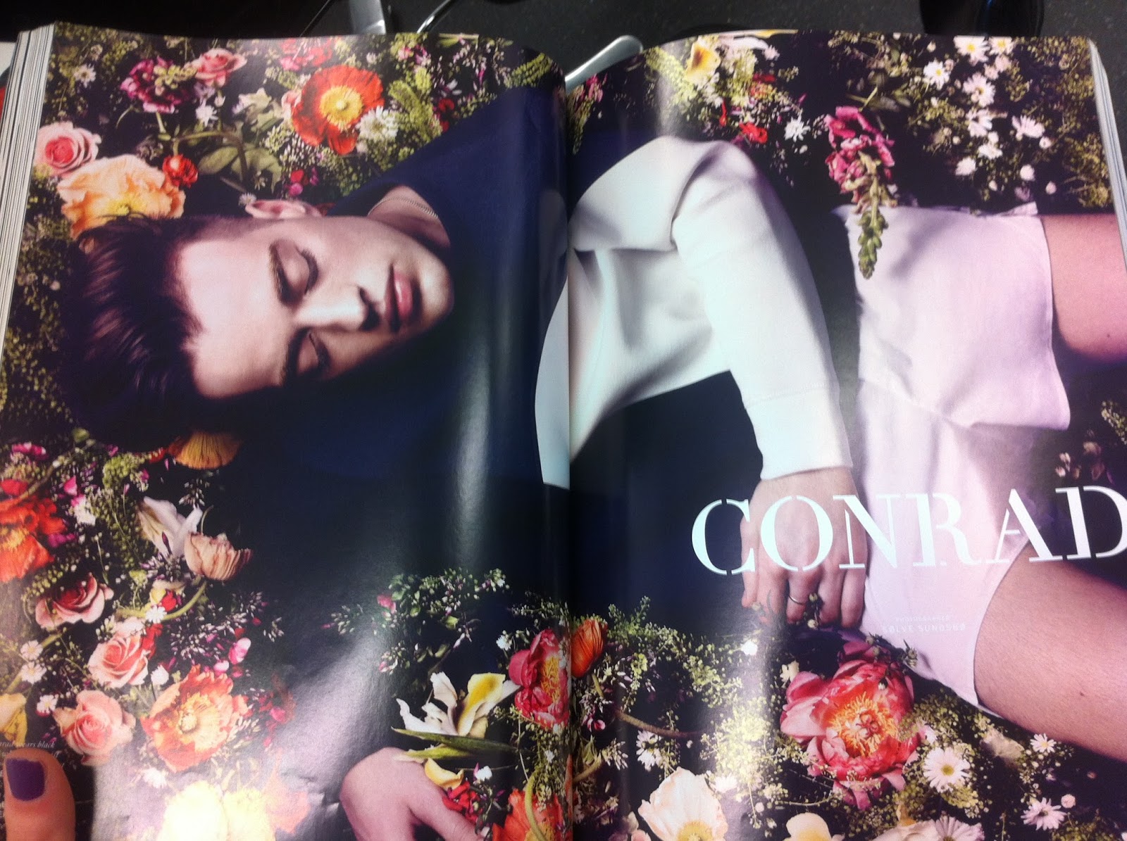
A/W 2013
Model: Conrad
Photographer: Solve Sundsbo
Florist: Rambert Rigaud
MUA: Lisa Eldrige
Hairstylist: Syd Hayes
Love Magazine
No other information found

Dior Homme jumper
A/W 2013
Model: Craig Green
Florist: Rambert Rigaud
MUA: Lisa Eldrige
Hairstylist: Syd Hayes
Photographer: Solve Sundsbo
Love Magazine
No other information found

A/W 2013
Model: Rambert Rigaud
Florist: Rambert Rigaud
MUA: Lisa Eldrige
Hairstylist: Syd Hayes
Photographer: Solve Sundsbo
Love Magazine

Marc Jacobs Beauty
Photographer: James Hawkesworth
Fashion Editor: Victoria Young
LOVE Magazine
Pages 350/351
In this editorial for Kurt Geiger I liked the hair and make up which I can link to my editorial, too. It is very sporty, yet chique. Her skin is beautifly bronzed and the hair looks messy, like she was caught mid workout.

Kurt Geiger Editorial
Style Magazine
April 3rd 2016
This editorial by Warehouse I simply liked because of the location and the beachy wavy hairstyles. Effortless, as if someone just took a photographs of two friends on holiday.

Warehouse
Spring 2015 Collection
ELLE
March 2015
This editorial by Marc Jacobs has the same hair and make up that was created by NARS at the Jacobs Spring / Summer 2015 fashion show. It is a look that I already talked about in my 'NARS Spring Summer Catwalk Looks' post. The make up was very simple and natural and all models wore these black wigs. However, at the shows models had nothing but moisturiser on, and here it is obvious that foundation was used, too, and her skin was retouched. This shows the difference between catwalk and editorial make up. Catwalk is a lot more organic while editorials are manipulated and edited a lot. Guess that is why they call them Edit-orials

Marc Jacobs
Spring 2015 Collection
ELLE
March 2015
The positioning of the image is what I liked about this one. As it is an editorial for a fashion brand, the fashion is the main focus. The blue eyeshadow links with this season's make up trend and the brand's name Paul & Joe matches that shade.

Paul & Joe
Spring 2015 Collection
ELLE
March 2015
Salvatore Ferragano's editorial looks quite tropical due to the location and the reflection of the palm trees in the swimming pool. Her skin is dewy and bronzed, the look I want for my editorial. Also, the white frame is here again, with more of it at the bottom (where the brand's name is) and none at the top.
Their editorial this year was quite similar, if I looked at the two images without knowing when they were created and published I'd think they are from the same season and year. The second image, just like the first, is quite blue but here it has quite a cool undertone in the contrast with the colourful shoes, while in 2015 the undertone was warmer. The water appears in shots from both editorials and I like how they used a close up of the shoes, too.

Salvatore Ferragano
Spring 2015 Collection
ELLE
March 2015

Salvatore Ferragano
SS16
Vogue
March 2016
Michael Kors SS15 editorial; this look is what I am after in my editorial look, too. Wet hair and glowing skin, only mine will be more wet as my model had just got out of the sea.

Michael Kors Editorial
Summer 2015 Collection
ELLE
March 2015
Coach Swagger had a mixture of black and white and coloured images for Spring Summer 2015. The hair links to my idea with the wet look, although I think that here their idea was that their hair got wet from the rain. I think that because: 1. the hair is flat on the model's faces which could happen if the water came from above; 2. the pavement on the coloured image is wet; and 3. this is a London based company, a city where it rains a lot, and the model's are wearing coats - summer is not too hot in the UK.

Coach Swagger Collection
Spring 2015
ELLE
March 2015

Coach Swagger Collection
Spring 2015
ELLE
March 2015
Etro, a brand that NARS works a lot at fashion shows. I liked the natural hair and make up which I will be doing for my catwalk Ready-To-Wear look.

Etro
Spring 2015 Collection
ELLE
March 2015
I couldn't stop staring at these two editorials by Hermes. The palm tree over lays they applyied to images that, without it look quite plain, made them look so tropical and so interesting. This inspired me straight away that I definitely have to do something like this in my editorials. This is so simple to create but the effect is just beautiful.


Flaneur Forever
Hermes Paris
ELLE
March 2015
The layout of this image by H&M is pretty similar to the one above. I liked how they didn't place the model in the middle of the page, and they left a lot of space around it.

SS15 H&M Collection
Photographer: Ben Morris
Model: Denisa Dvorvakova
Fashion stylist: Michelle Duguld

Photographer: Bjarne Jonasson
Fashion stylist: Anne - Marie Curtis
Model: Li Xiao Xing
ELLE
March 2015
Page: 298

Photographer: Bjarne Jonasson
Fashion stylist: Anne - Marie Curtis
Model: Li Xiao Xing
ELLE
March 2015
Page: 301
The model in Saint Laurent's editorial is wearing the crown that was used in the catwalk show, too. Here the hair is covering the models face, so no make up is visible. It is shot in black and white. I don't exactly know why they used the brick wall with geometrical shapes and monochrome shades, but I think that that type of contrast was needed. If the other page was plain white everything would look a bit too flat, black could work with the brand's logo in white. But I think that they decided to go with this option because it reflects the mixed denim jacket that the model is wearing.

Saint Laurent Paris
SS16
Vogue
March 2016
I thought this two page spread by MARNI had an interesting concept as they put their logo in the middle of the right image where the model and the dress are and the left image only shows the trees and the sky that are in the background. Also the model's blonde hair looks like it is lighter because of the sun that is shining through the trees. It must have been hard to find the right location and perfect light to get this beautiful shot.

Marni
SS16
Vogue
March 2016
Another wet hair look and sun-kissed skin in Georgio Armani's editorial for Spring / Summer 2016.

Giorgio Armani
SS16
Vogue
March 2016

DKNY
SS16
Vogue
March 2016
A complete opposite to the black and white editorials was the very colourful editorial by Dolce & Gabbana. The brand always takes inspiration from its italian culture, and in this one they went all out. The two page spread is full of different colours and patterns; horitzontal and vertical stripes, checkered table cloth a lot of flowers and fruit. They created a setting of a typical italian market and used a mixture of young and elderly models to show the close relationship that italian families have. The make up and hair accessories were seen at their catwalk, too. When walking down the catwalk the models took selfies on their phones, and they are doing the same here.

Dolce & Gabbana
SS16
Vogue
March 2016
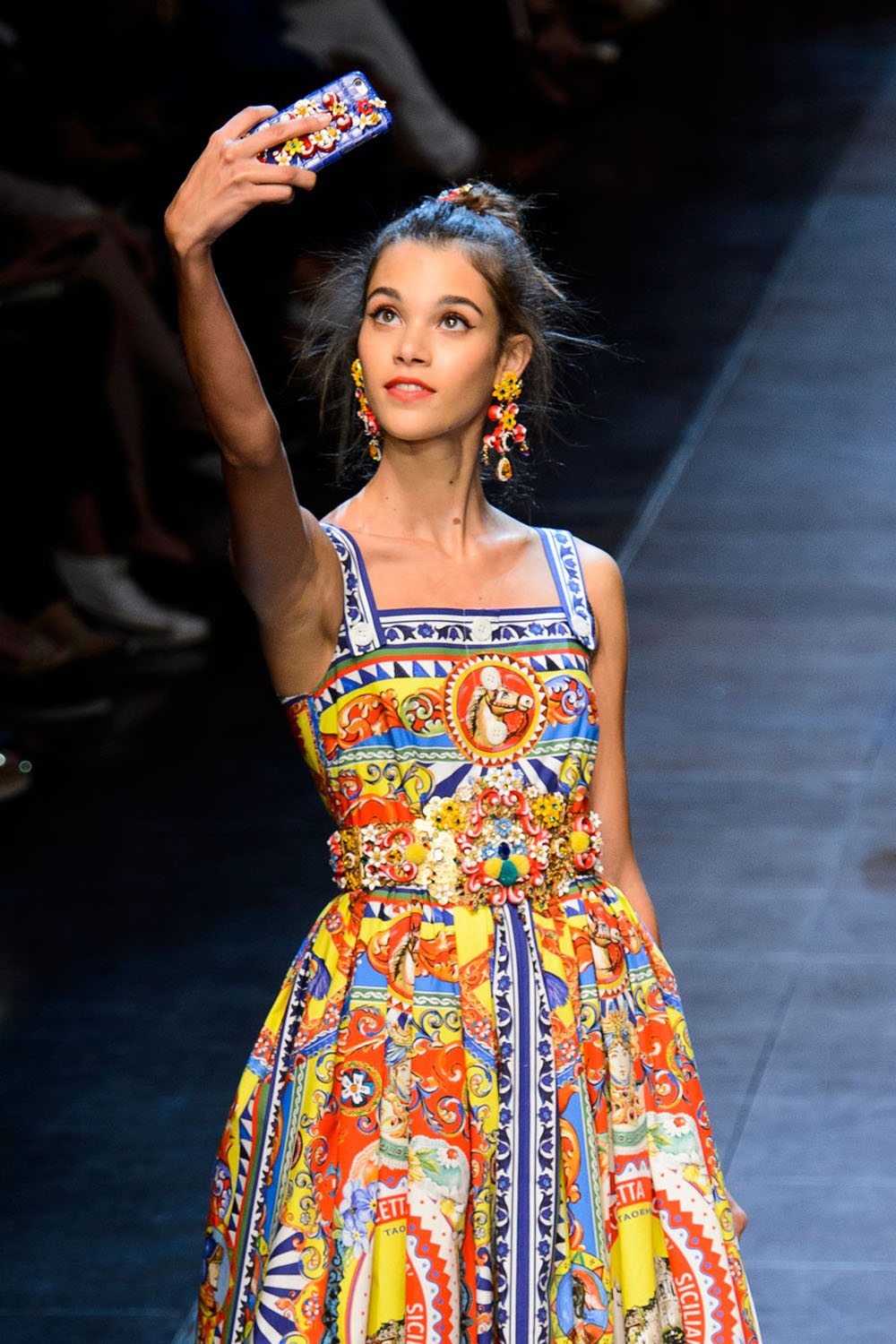
Dolce & Gabbana
SS16
Marie Claire Magazine
Article: Dolce & Gabbana’s SS16 Show Was A Beautiful Ode To Pizza And Selfies. Yes, Please..
Author: Leaper C.
Date: Sep 28 2016)
(Source: http://www.marieclaire.co.uk/news/fashion/550558/dolce-and-gabbana-ss16-fashion-show-pictures.html#index=1
Accessed: Apr 5 2016)
This Marc Jacobs SS 16 editorial literally looks like it was shot after the fashion show ended, only here the hair is down. The make up was created by NARS. The black background and dark dress are contrasted with the white framing.

Marc Jacobs
SS16
Vogue
March 2016
This last few images are from an editorial for Westfield that was in Vogue 'Shop the Season' short magazine. There was no information on the model, MUA, etc, however it's the location that I really like and could be linked to my idea. The model's poses show that she is relaxing on holiday, her skin has a beatiful glow and I think it's really cool how they did one in black and white and all the other images in colour. I also liked her hair and the last image with the sunset in the background inspired me to maybe do a sunset overlay if the palm trees will be in the day look.
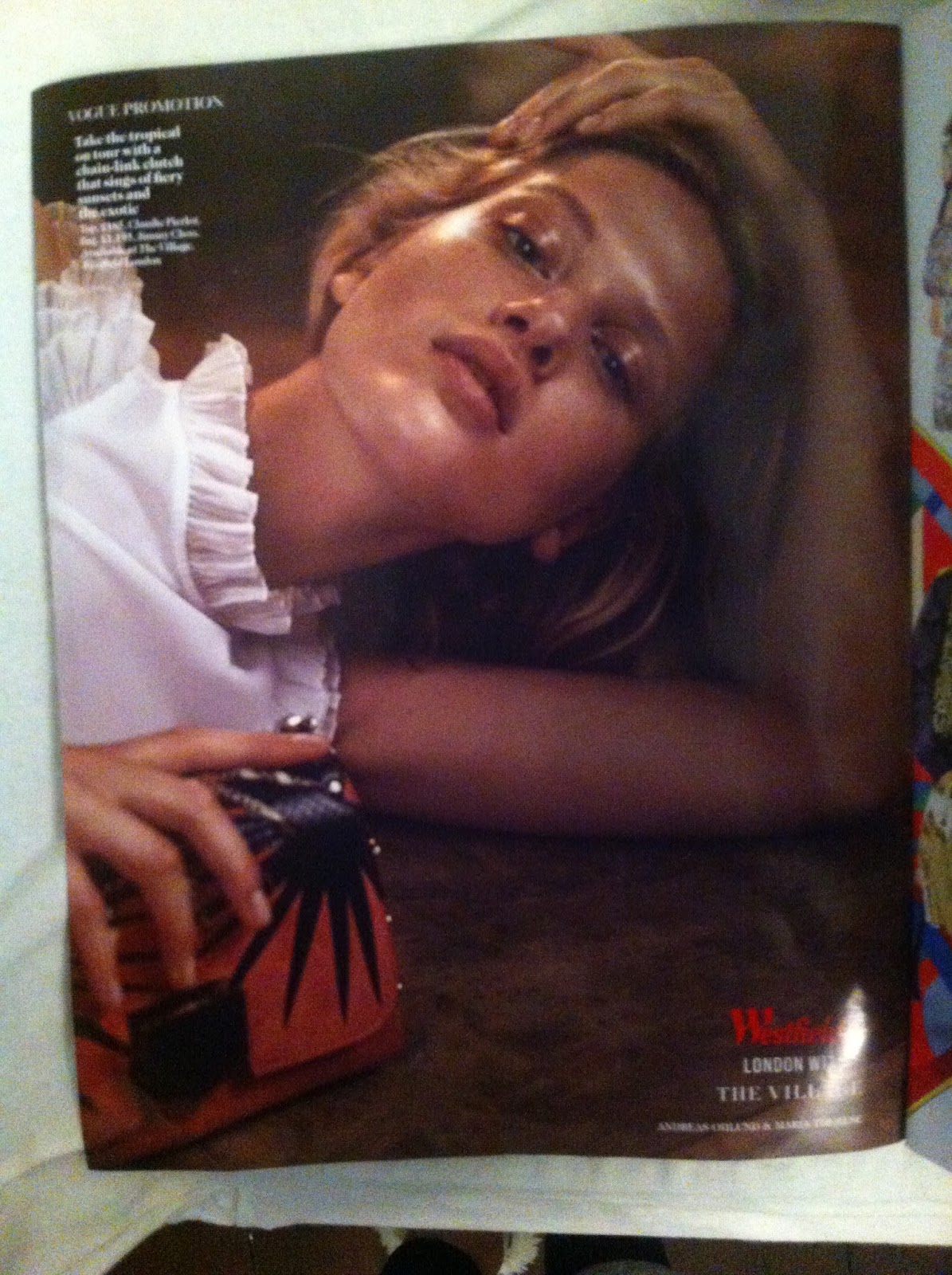


Westfield Advert
Vogue 'Shop The Season' bonus magazine
Spring / Summer 2016

Westfield Advert
Vogue 'Shop The Season' bonus magazine
Spring / Summer 2016

Westfield Advert
Vogue 'Shop The Season' bonus magazine
Spring / Summer 2016
Nema komentara:
Objavi komentar